Property
Subverting luxury.
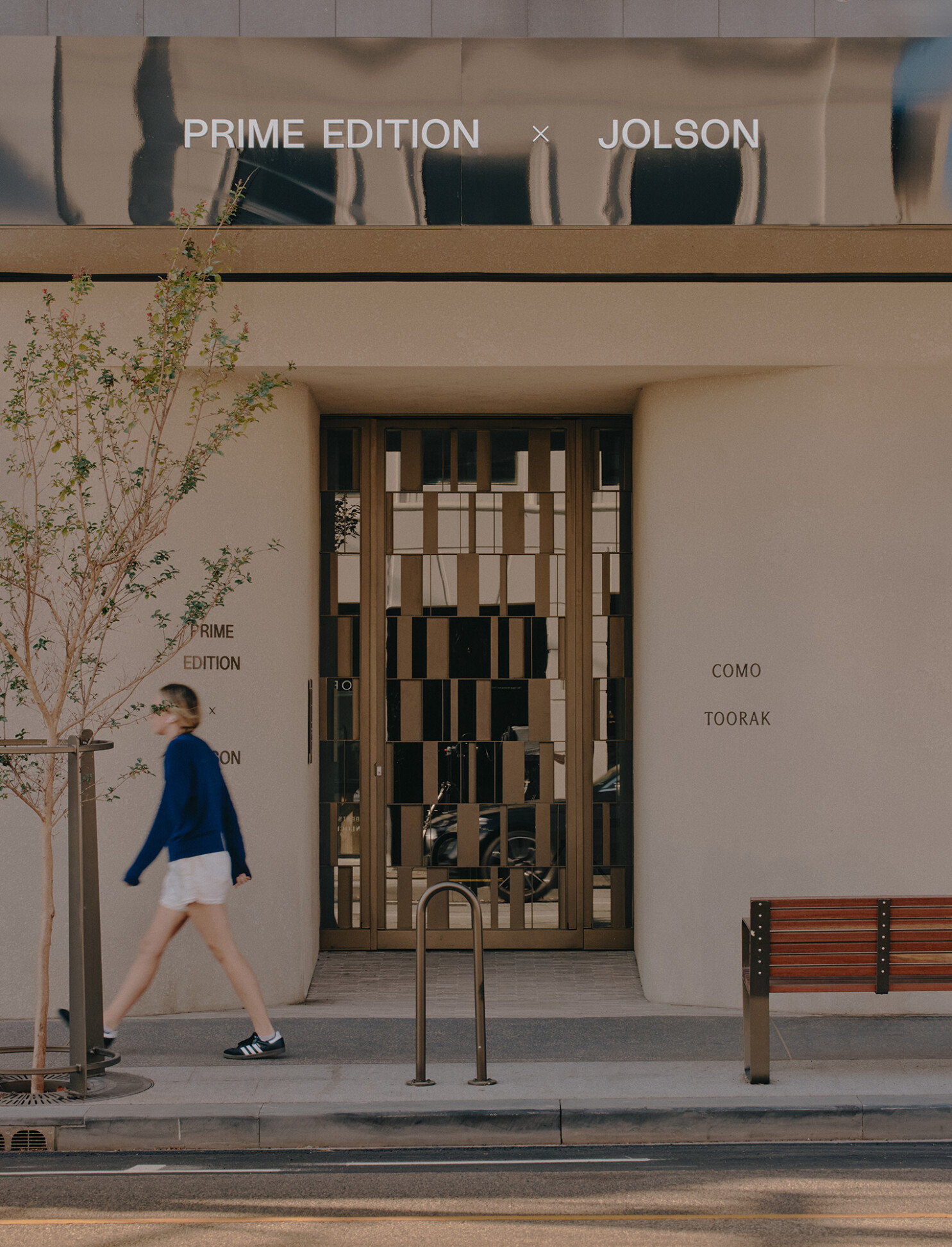
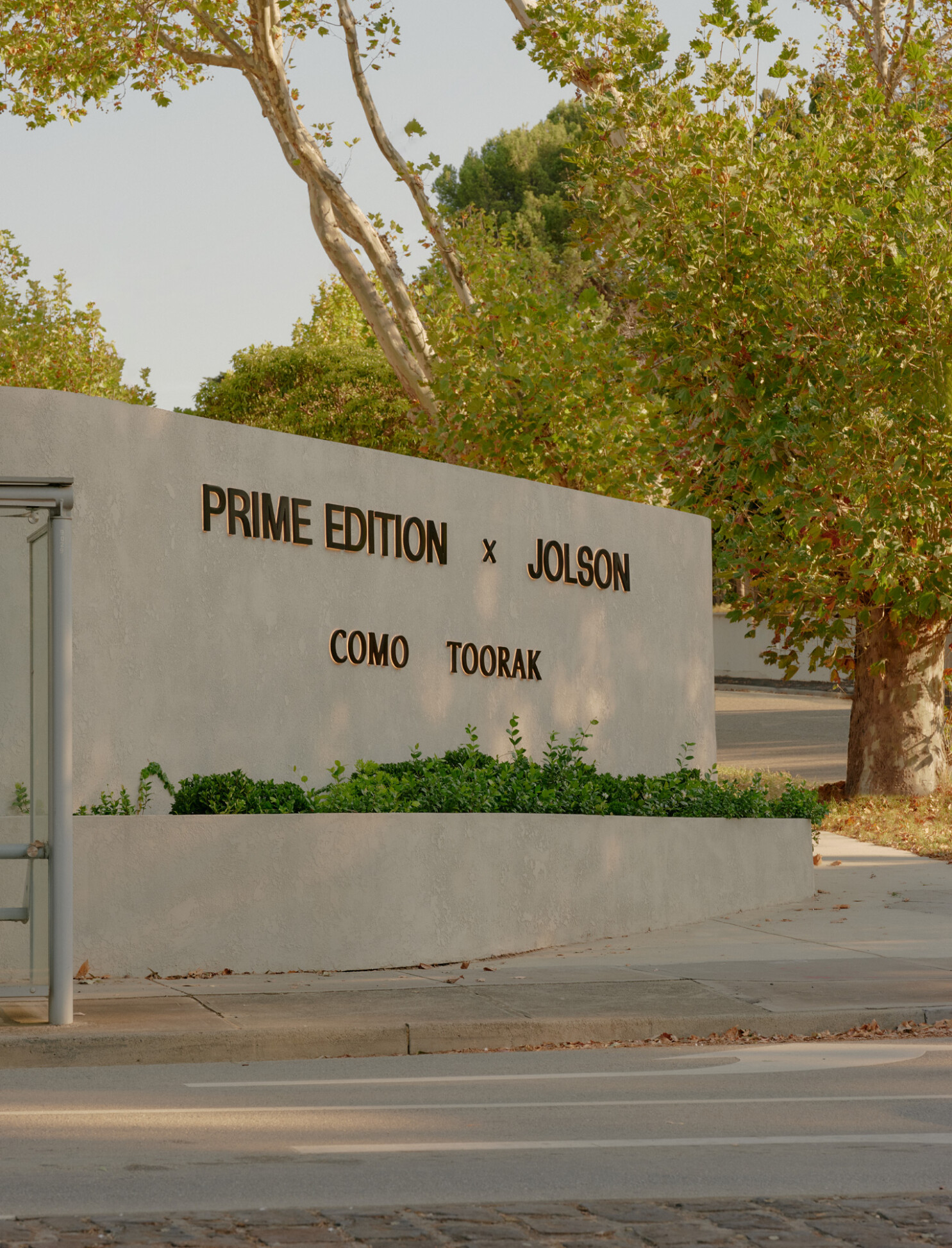
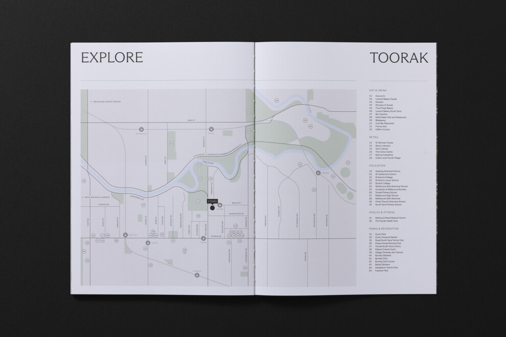
Como, Toorak
Luxury is a subjective experience, and for this discerning audience, we found that true luxury is defined by exclusivity.
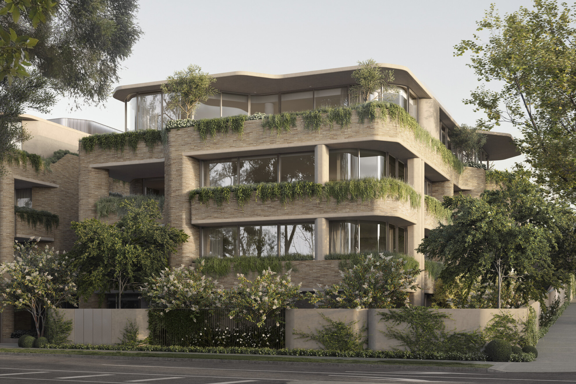
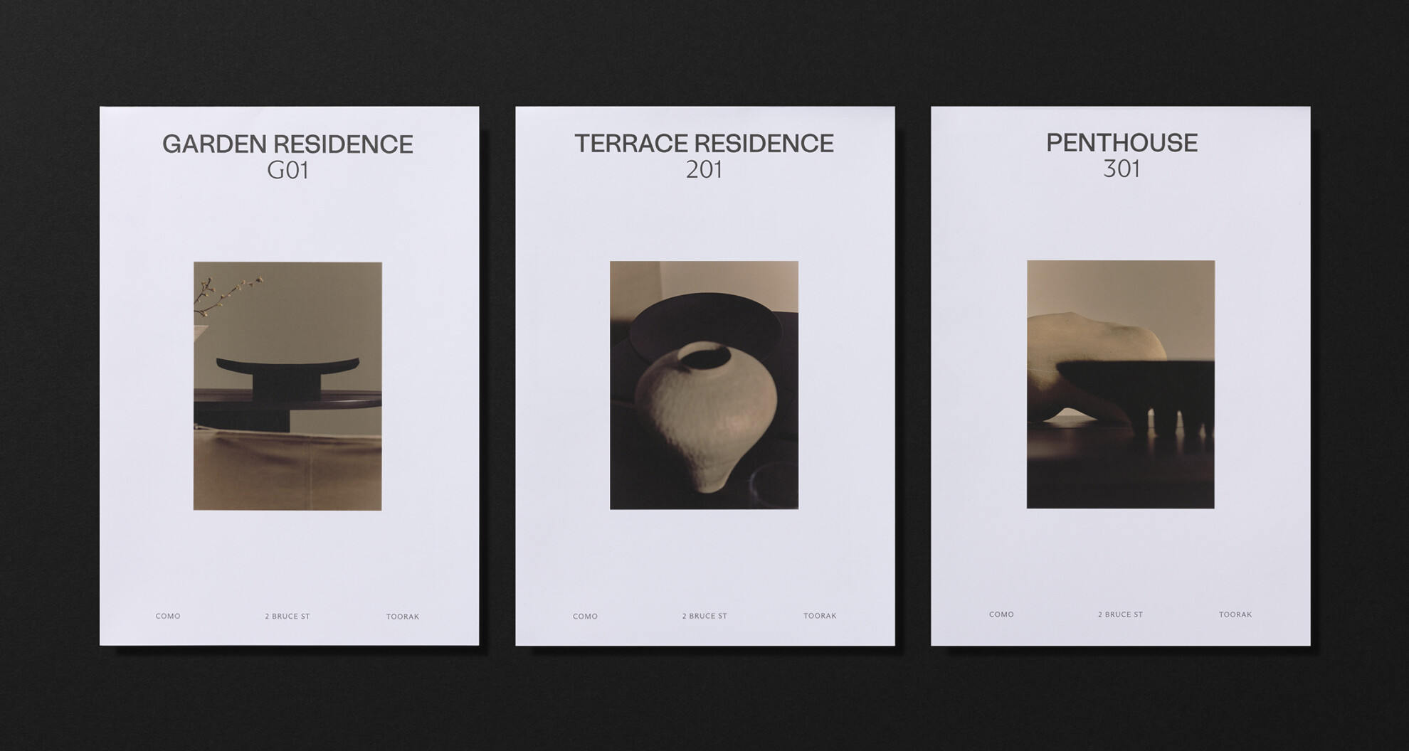
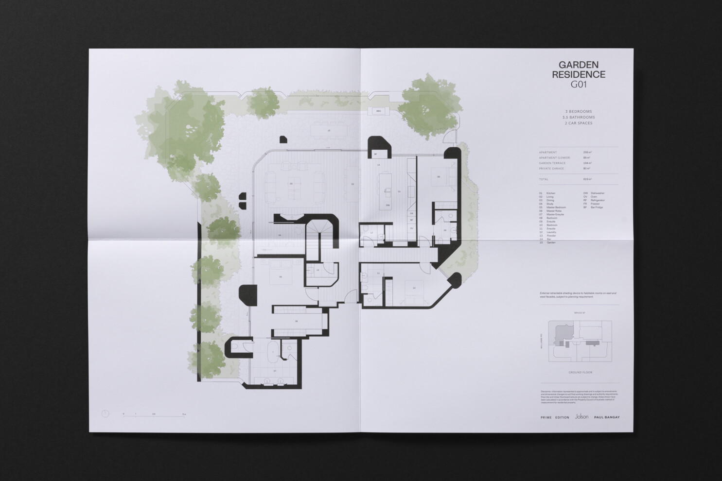
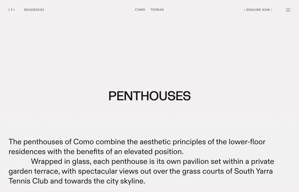
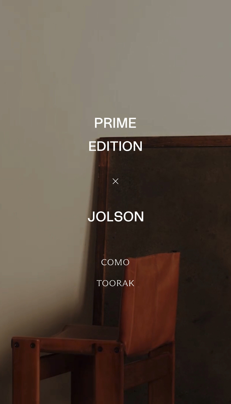
Como is a collection of seventeen residences in the heart of Toorak, designed by acclaimed architects Jolson and delivered by Prime Edition. Our conceptual approach to this campaign was to unveil a vision of luxury that this audience had yet to encounter in their area — a contemporary and evocative interpretation to intrigue and captivate.
Sector
Services
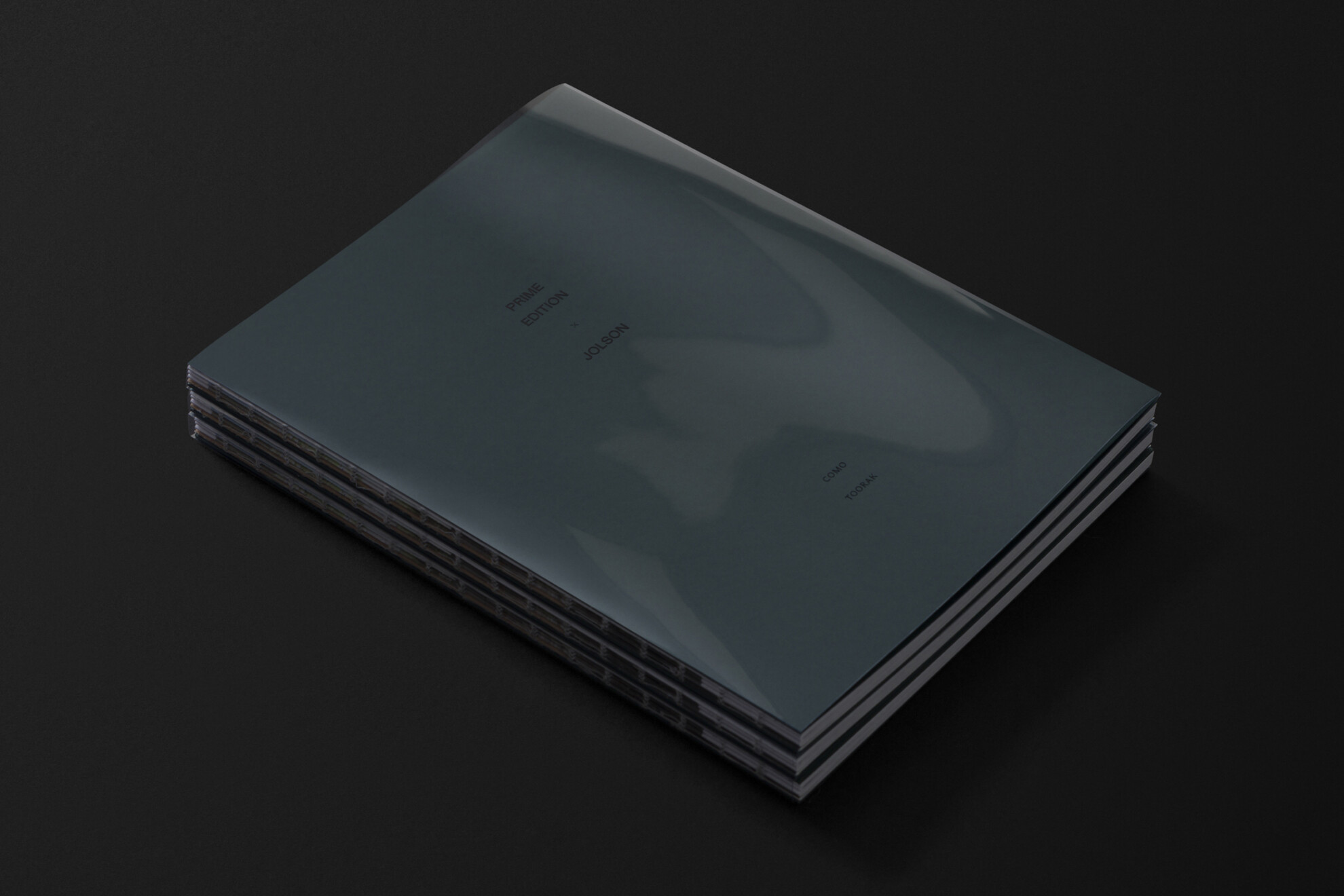
Brand Strategy & Naming
Identity Design
Art Direction
Print Design
Website Design & Development
Collaborators
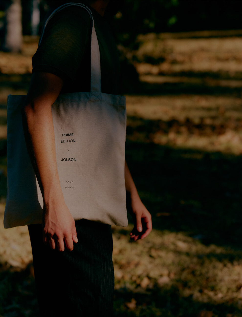
Brand photography by Annika Kafcaloudis
Styling and production by Marsha Golemac
Film directed by CCMM
Film music by Elliot Munn
Copywriting by Letterform
Architectural visualisations by Gabriel Saunders
Location photography by Gavin Green
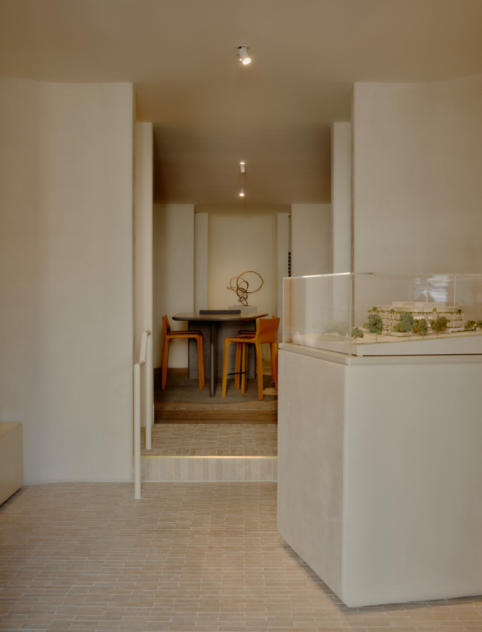
Display gallery photography by Pier Carthew
Website
Leveraging legacy
As Prime Edition is a new developer, it was essential for us to establish a campaign model and long-term strategy for their current and future projects. To create an immediate impact, and build long-term equity in the Prime Edition brand, we challenged the traditional and often repetitive framework of property project branding.
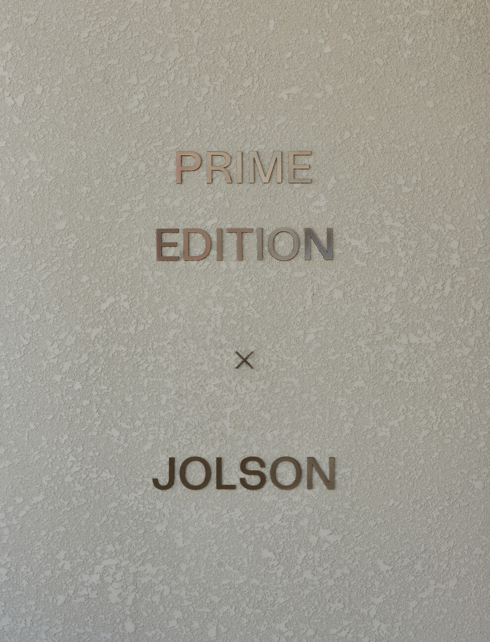
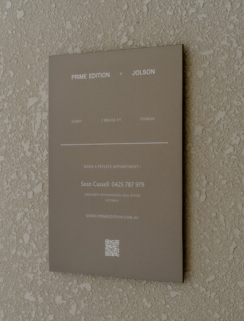
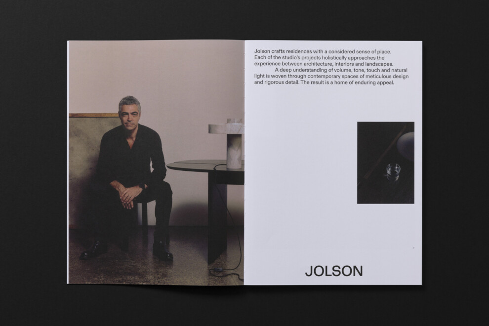
This architect- and developer-led framework places the project title in a secondary role, prioritising the names of the collaborators. By shifting the focus away from conventional project names, and focusing on the esteemed design team – in this instance Jolson, well-regarded in the Toorak area – we are further emphasising the strength of partnerships and confidence in the project team.
Evoking sculpture
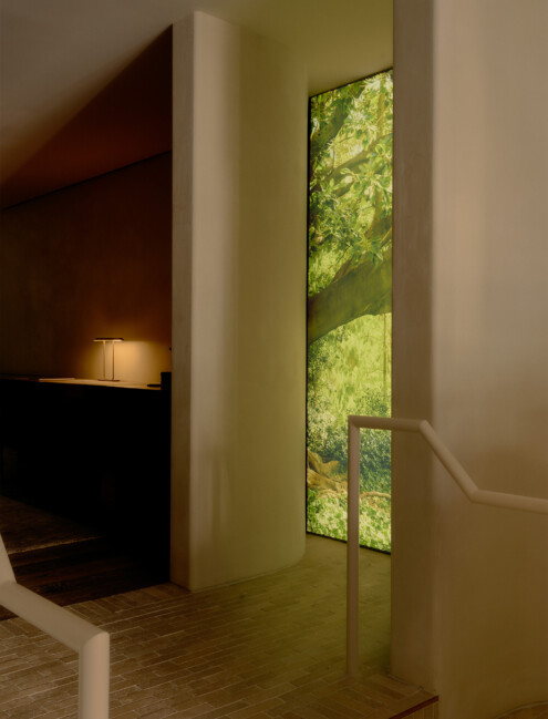
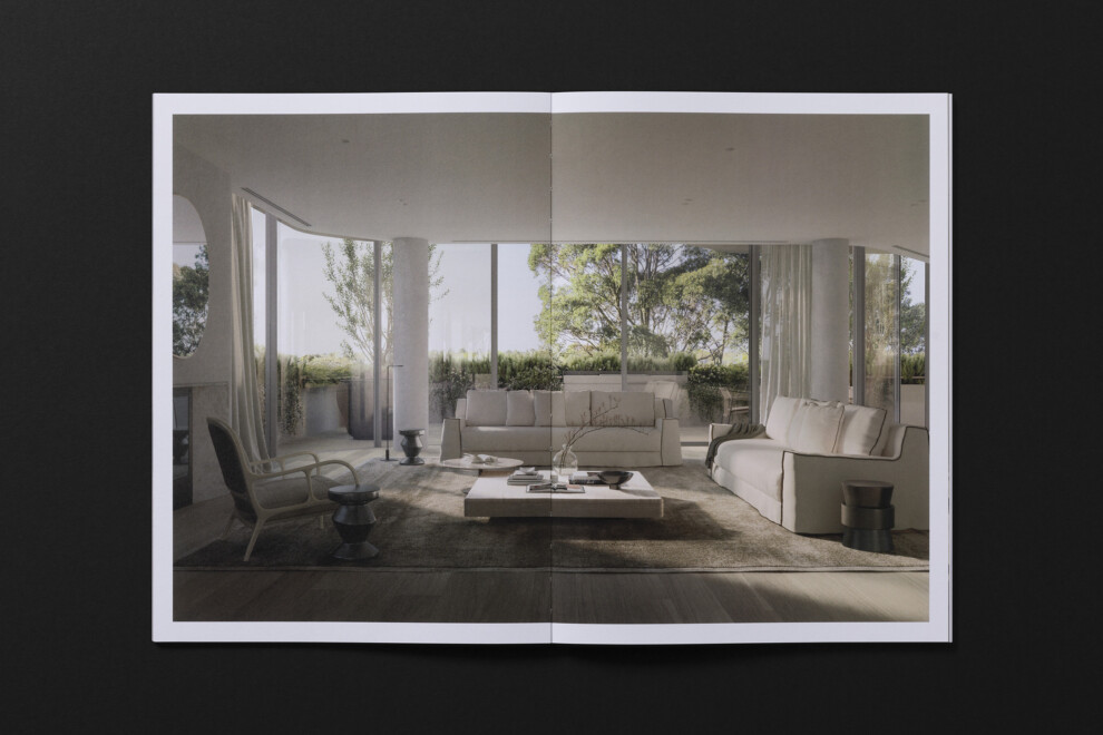
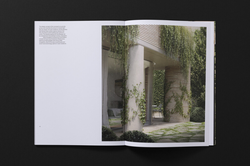
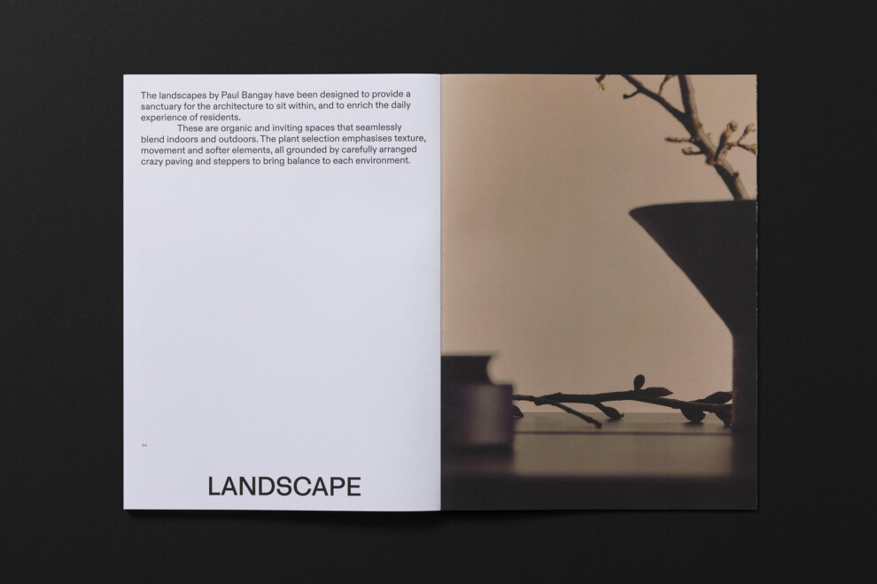
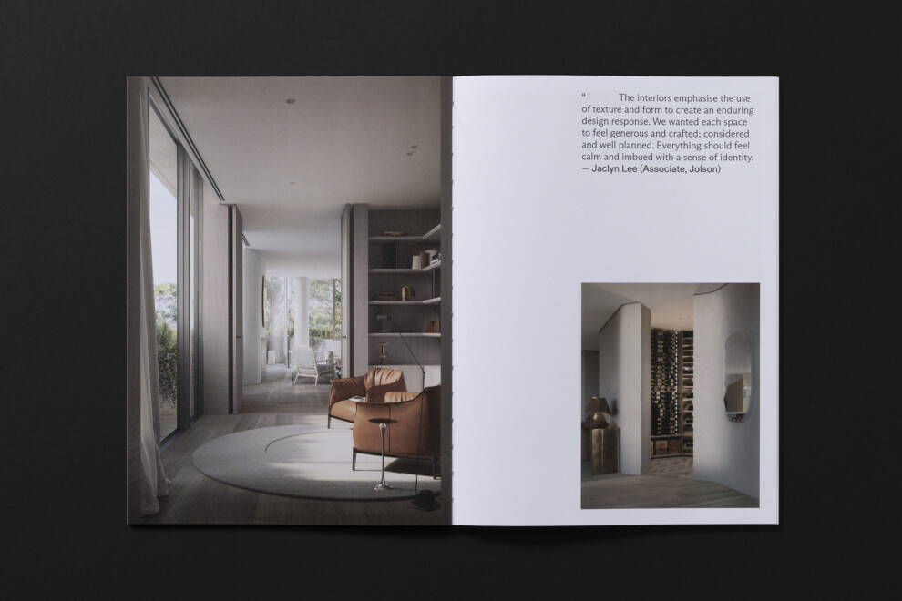
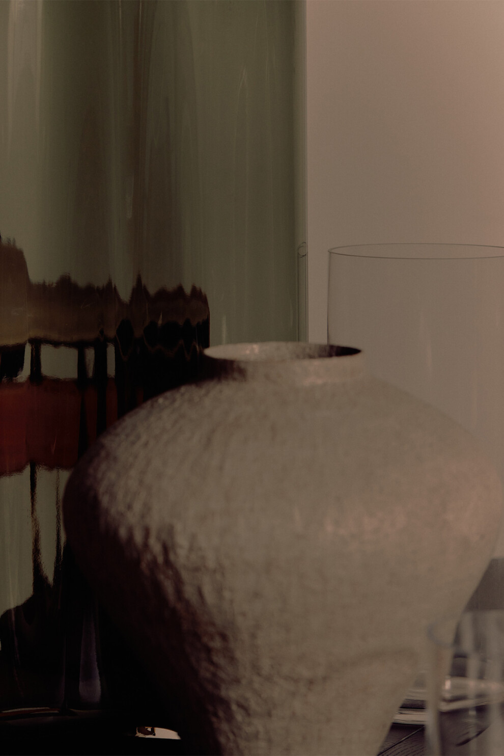
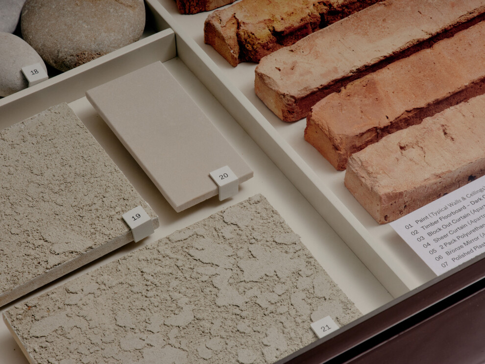
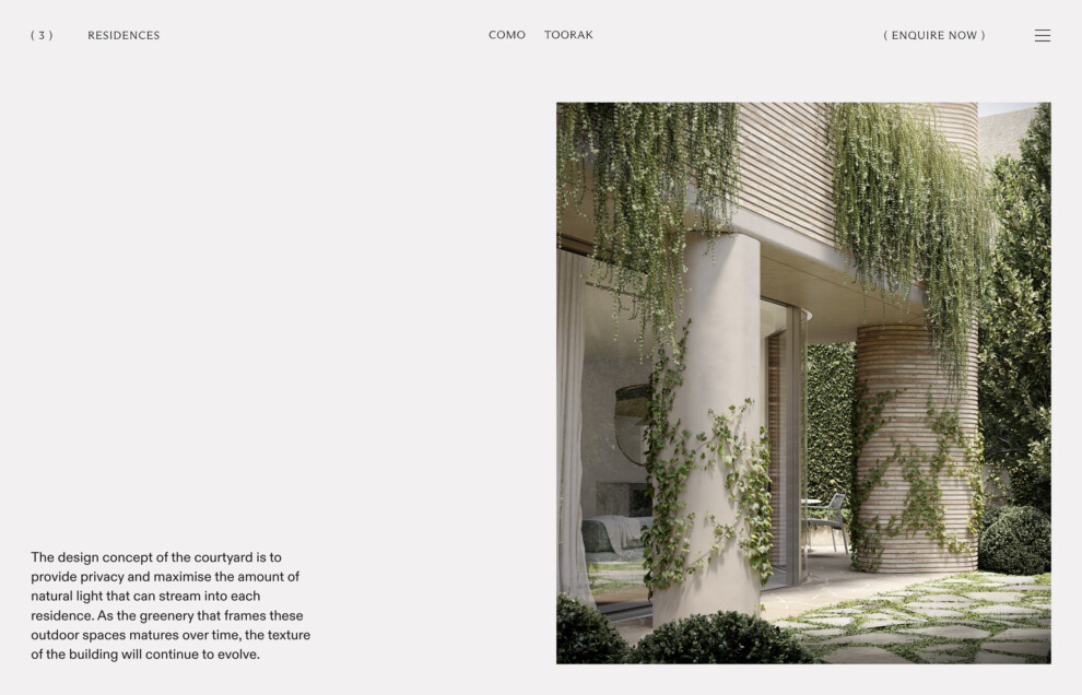
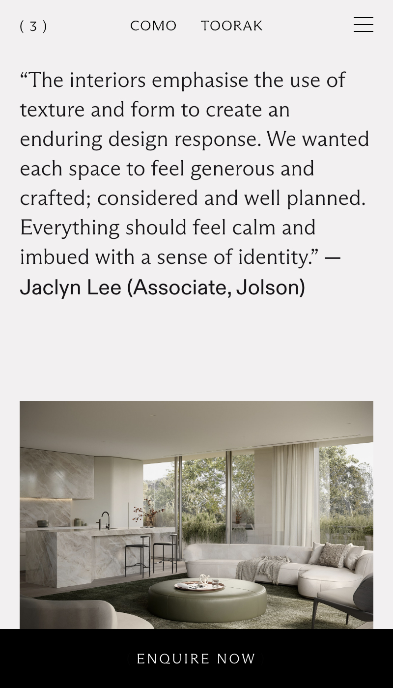
Through Como’s design, Jolson celebrate the harmony between space and form, expressed through a refined palette of materials, meticulous attention to detail, and a sense of lasting distinction.
A compelling narrative weaves throughout the campaign applications, particularly in film and photography, evoking mood through texture, a neutral palette with earthy tones, and significant sculptural elements that mirror the detailed design language of the architecture.


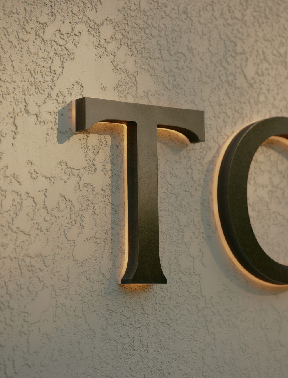
The identity also extended into the physical space, displayed in a sales gallery nestled among the sleek retailers on Toorak Road. The external facade echoed the building’s curved forms, with signage maintaining the same level of restraint and simplicity against the textured details.