Corporate
Property

MONNO, previously CostaFox, were named for their singular, peerless positioning within the property development field. This transformation repositioned the brand to align with a more contemporary and sophisticated perspective, highlighting an obsession with exceptional design and quality.
Corporate
Property
Naming
Identity Design
Print Design
Website Design & Development
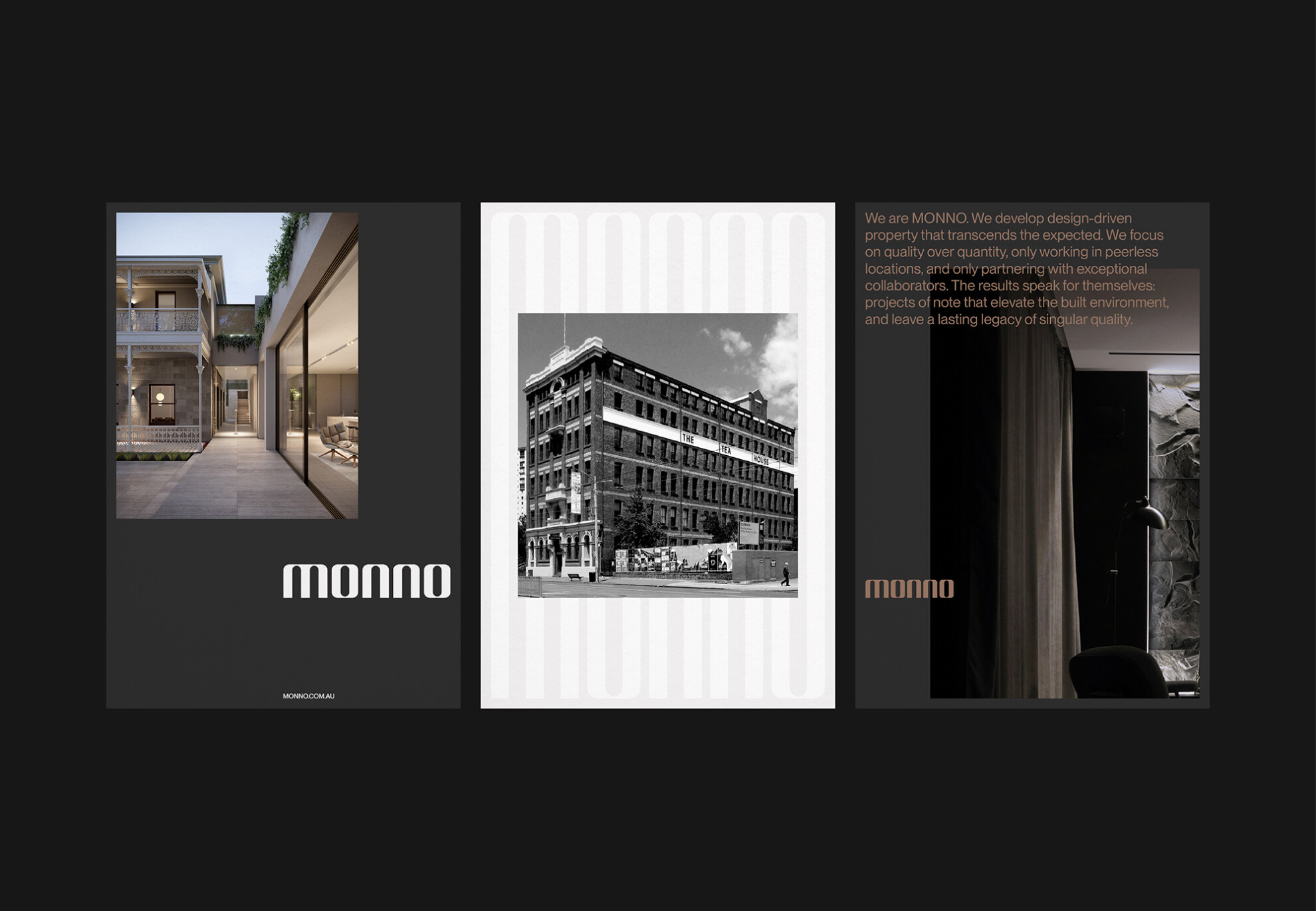
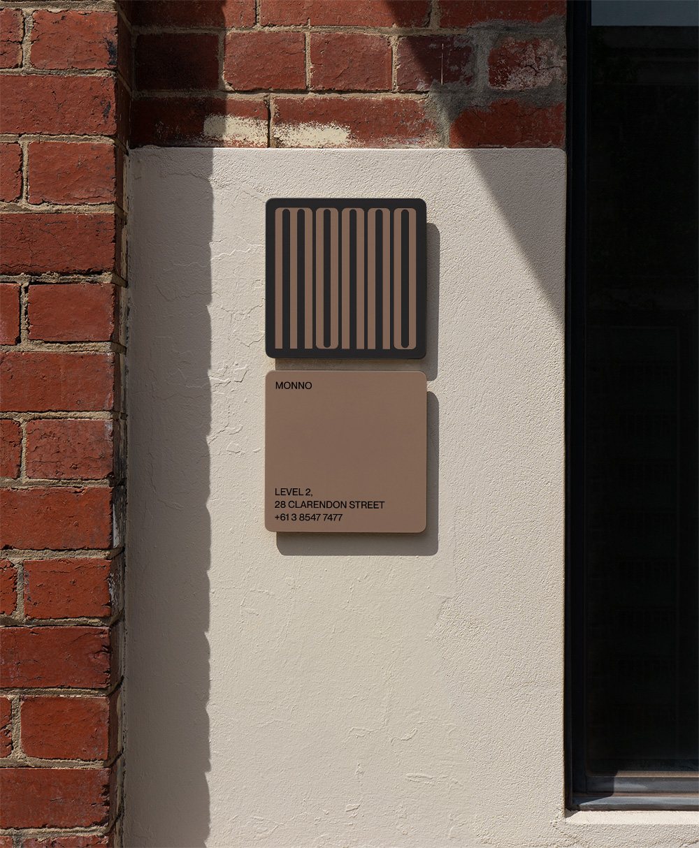
The MONNO wordmark has a refined architectural quality with strong vertical forms and soft curved edges. A dynamic form with a variable height, the typographic mark works as a flexible graphic device.
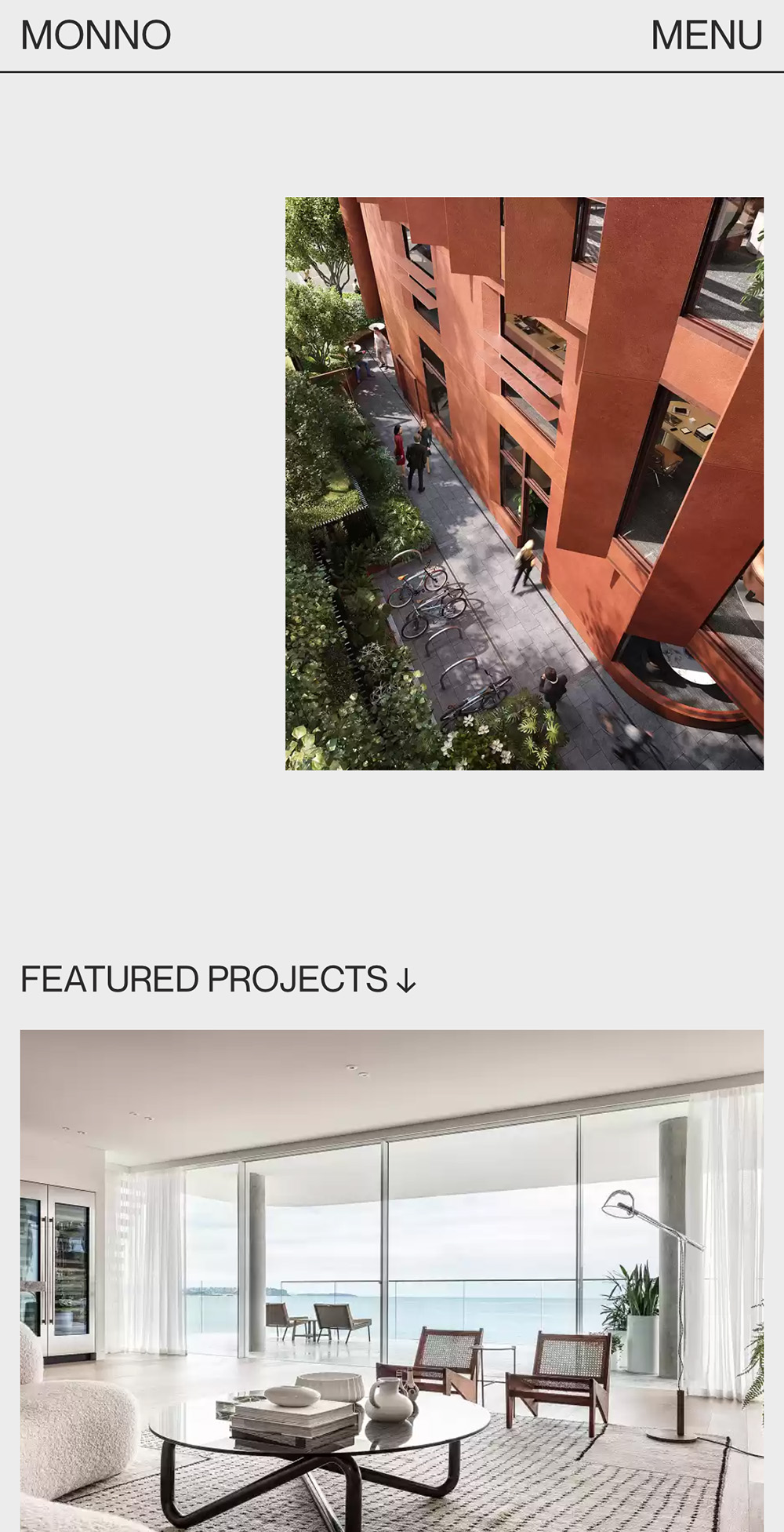
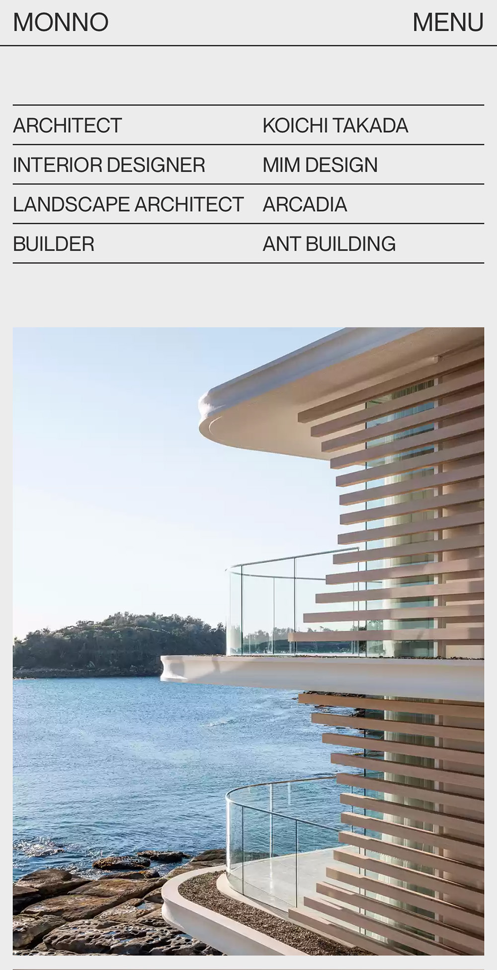
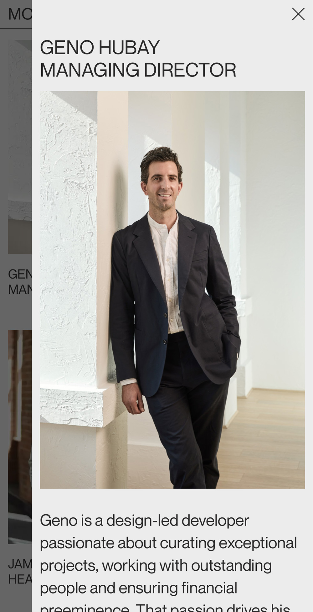
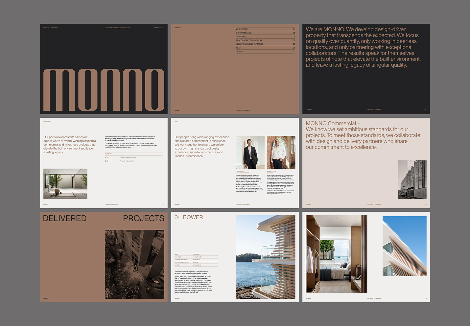
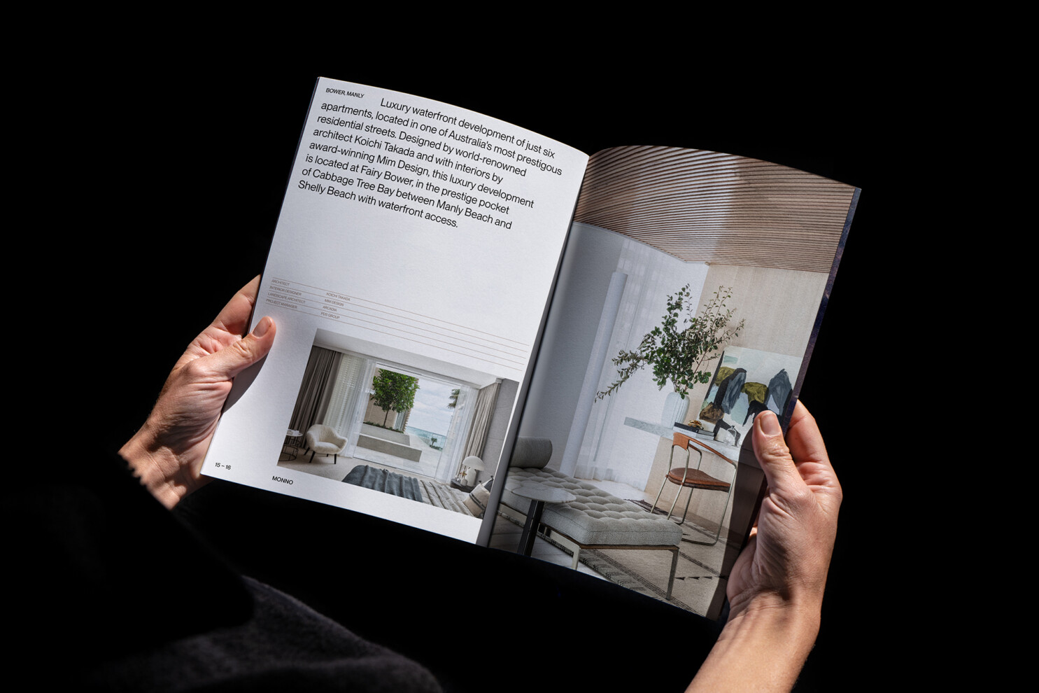
The use of a single typeface, a restrained colour palette and sharp, minimal layouts reinforce MONNO’s commitment to a quality over quantity approach to property development.
