Corporate
Kids at the heart of everything.
Kids First
Kids First, formerly Children’s Protection Society, has been working with children and families for over 120 years.
The rebrand provided an opportunity for transformation, both internally and externally, with a focus on establishing Kids First as a leader in their field.
Brand Strategy & Naming
Identity Design
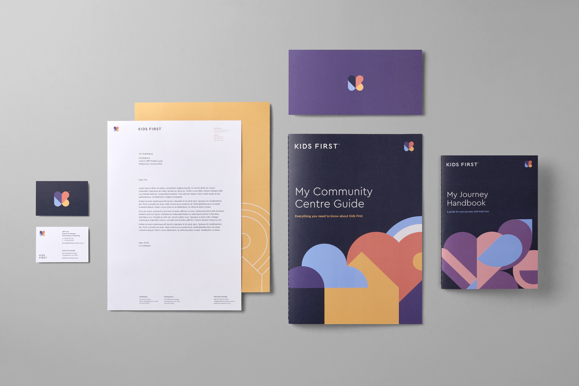
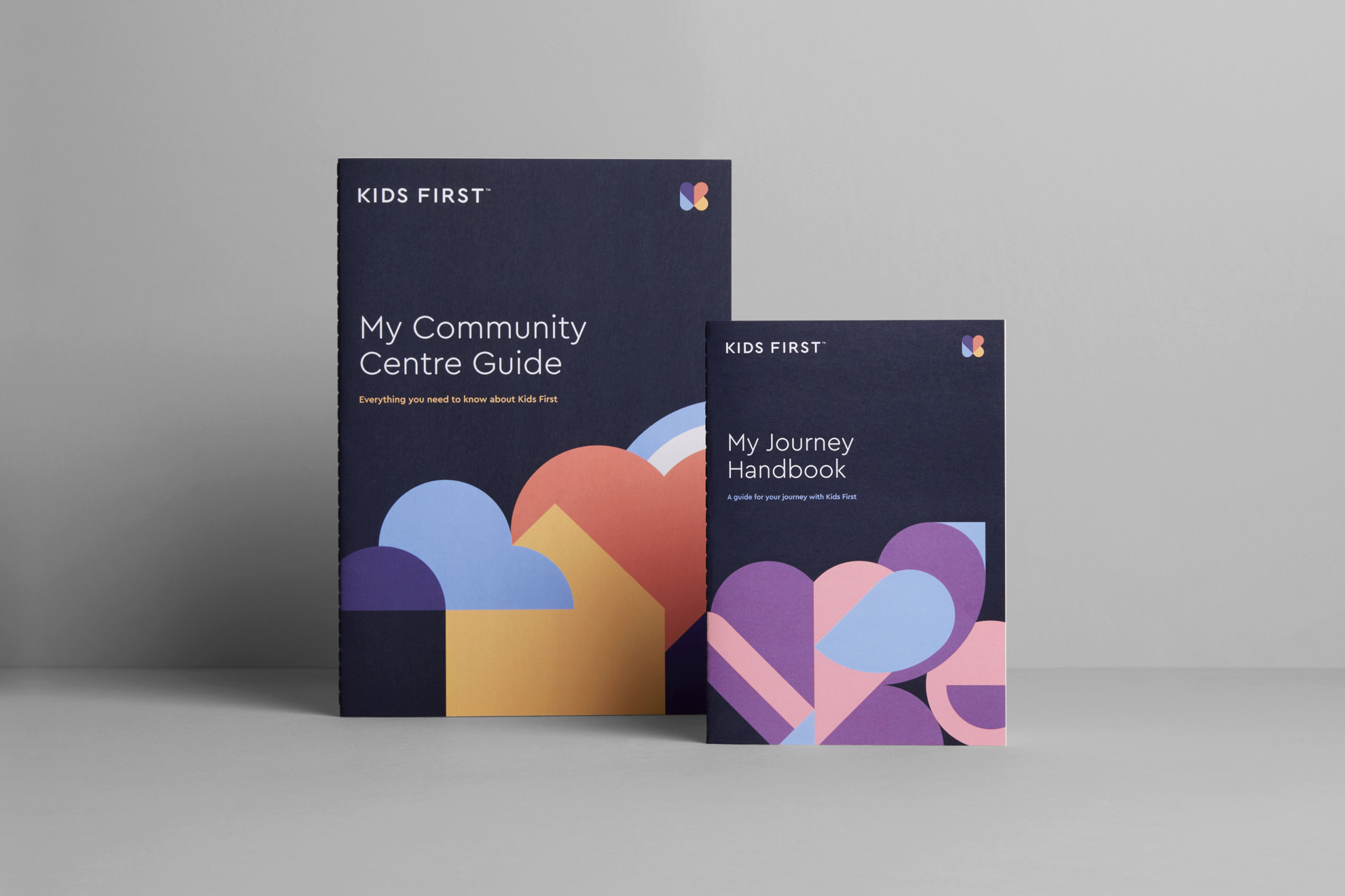
Print Design
Environmental Signage
Illustration

Kids First is guided by its core principles of Hope, Empowerment, Accountability, Respect and Trust – abbreviated to ‘HEART’. It was integral that these principles informed the visual language developed for the rebrand.
The result was a multifaceted brandmark, representative of both a literal heart as well as the concept of transformation. An extendable series of supporting illustrations were created to further extend the visual language of the brand across a wide range of applications.


While directly communicating with children, Kids First also engages a wide range of audiences, including government bodies, organisations and philanthropists. Therefore one of our key challenges was to develop a brand that struck a delicate balance between a youthful and optimistic spirit, as well as a sense of maturity and authority.
Working within one of the the most diverse and challenging sectors of community care, considerations were made given the sensitive nature of the topics often covered in information provided by Kids First.


An extensive set of guidelines were developed for Kids First to use internally to ensure the consistency of the brand across all touchpoints in the future. The document defines regulations concerning the usage of the logo, visual language, colours and typography, and are continuously updated with the most recent brand applications.


