Creative Services
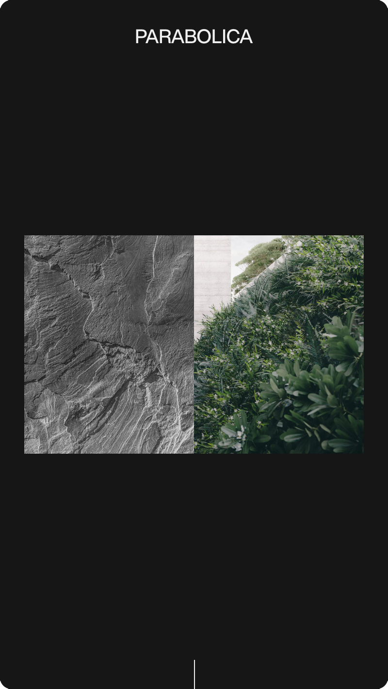
Harmonious contrasts.
Parabolica
Parabolica is a South Australian architecture practice interested in harmonious contrasts – creating spaces that are intimate, yet monumental; simple, yet thoughtful; inspired by the past, yet looking to the future.
Sector
Services
Brand Strategy
Identity Design
Print Design
Website Design & Development
Website
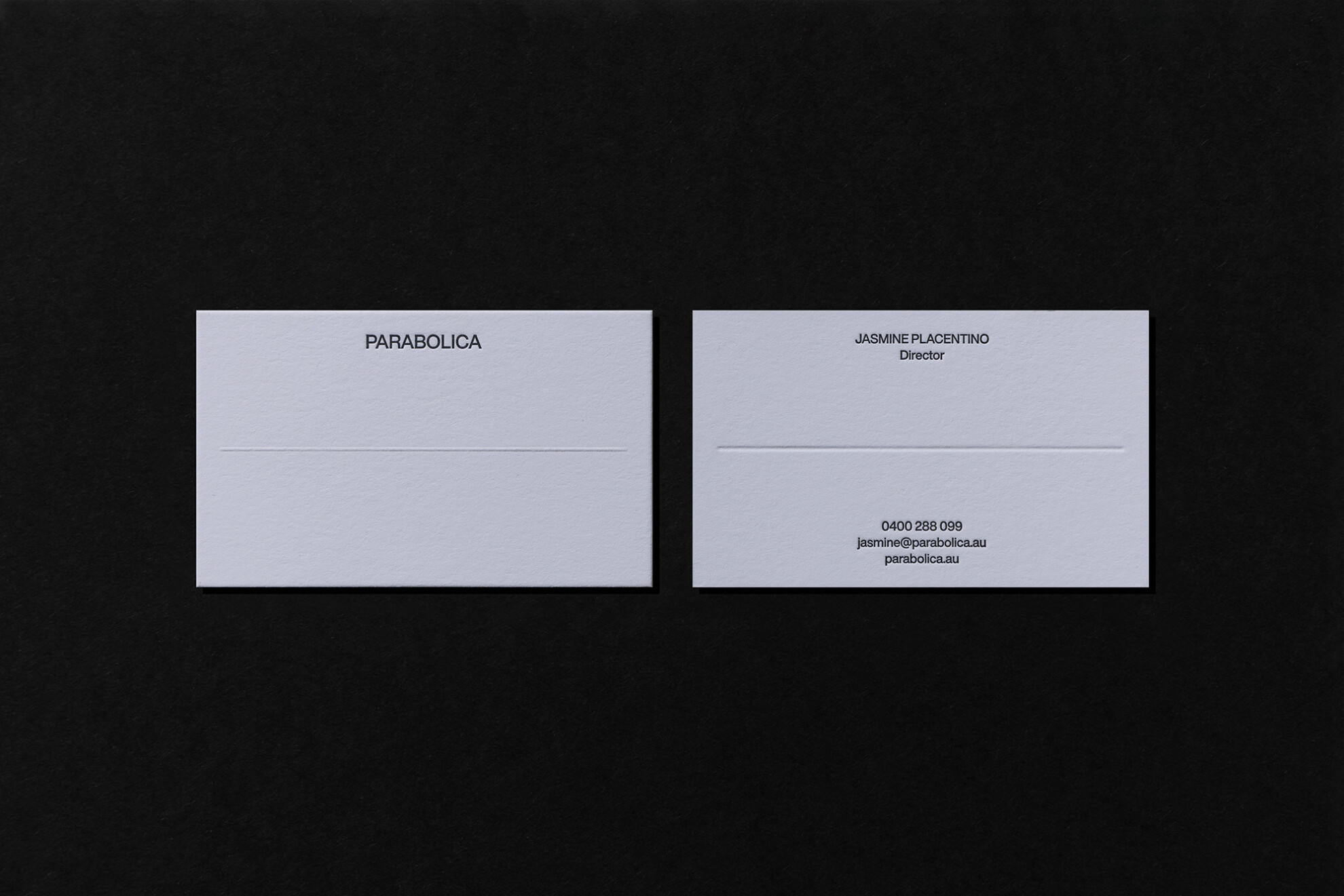
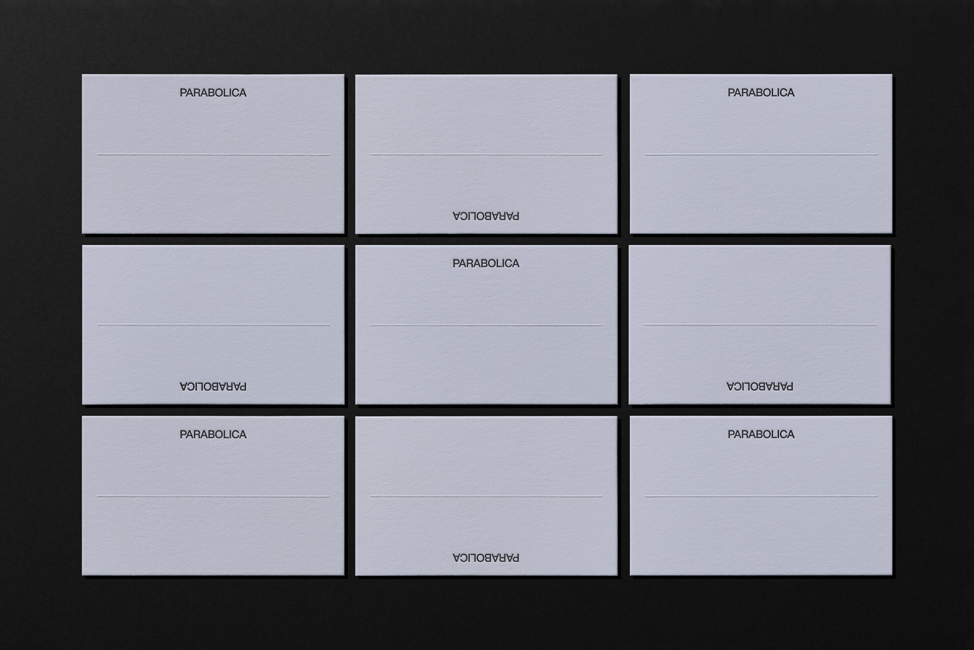
We approached the Parabolica identity with an almost anti-brand philosophy – exercising restraint to create an effortless and timeless visual identity. Thoughtful typography is paired with a minimal yet flexible layout system, contrasting imagery, and tactile paper stocks.
The reductive approach is evident in the typeface selection – modern updates of arguably the two most ubiquitous contrasting typefaces, Helvetica Now and Times Now.
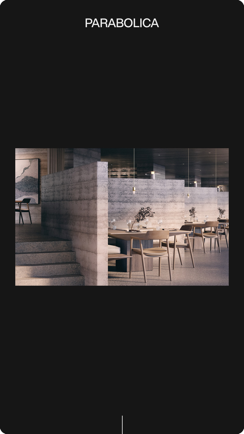
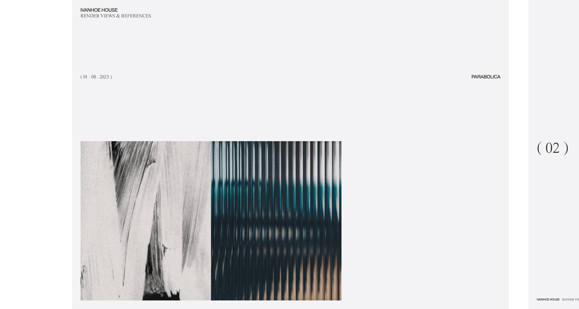
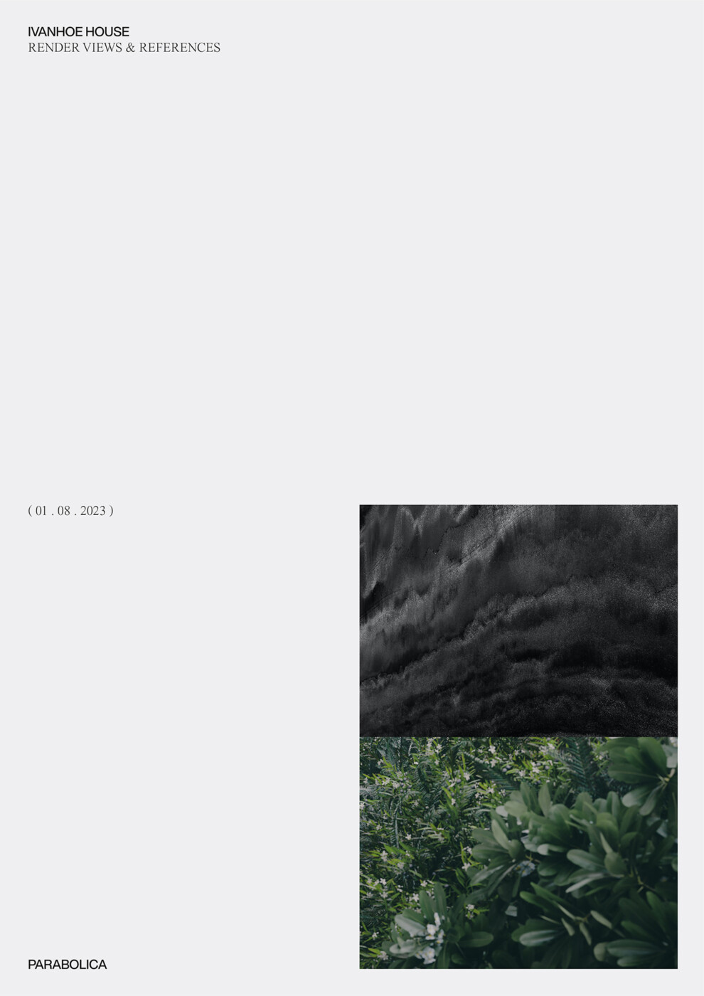
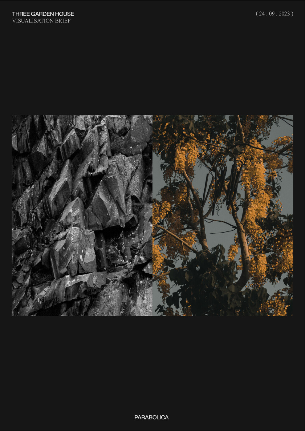
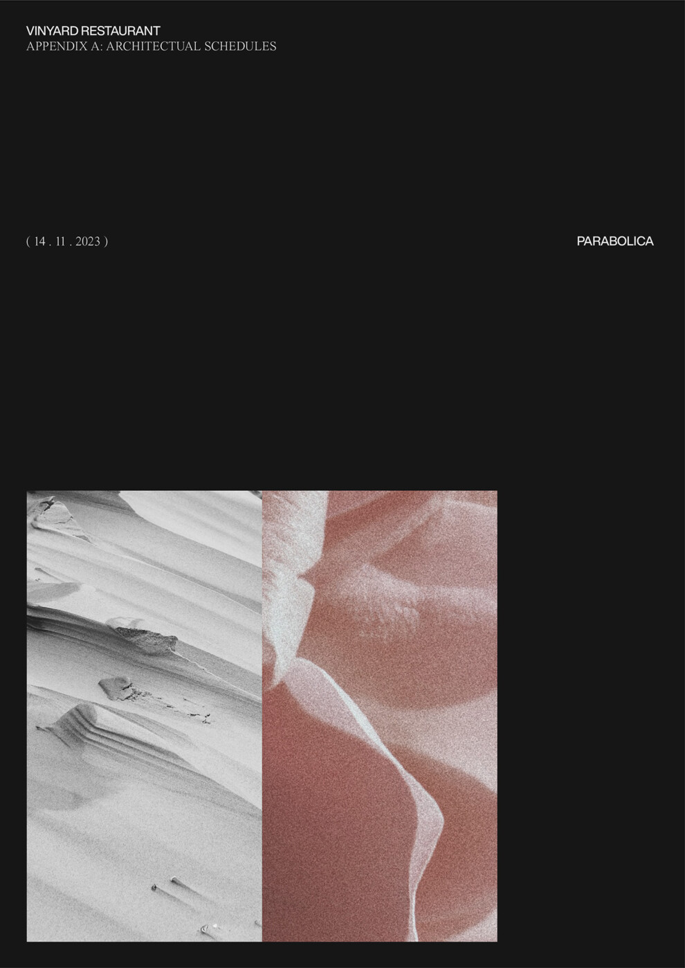
Each client interaction is personalised through the creation of an artistic visual representation of each project. Utilising two contrasting images inspired by a certain aspect of the associated project – whether it’s the architectural concept, the surrounding environment, the proposed materiality or the purpose of the finished building.